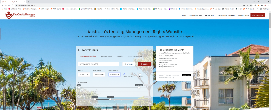
The last time we launched a new site version was 2016 so it was long overdue for a facelift! Due to the significant traffic the site receives these days we’ve opted for a graduated upgrade where we’ll overhaul various sections of the site on a piecemeal basis to reduce the overall disruption and minimise the learning curve for our users.
We started with the homepage because it’s the FACE of the website. We’ve gone for a lazy load approach that rapidly speeds up the load time of objects and graphics and improves the user experience. We’ve streamlined element design and standardise functionality, improved phone and tablet support and blah blah blah… it looks and works better, ok??

We took a lot of care to refine the search system. It looks much simpler now with just search categories being tabulated (Management Rights, Hospitality, Rentals and Investment Properties), a locality box, and options button and a search button. Way simpler than previously. But if you expand the options out, you access all the ways to fine-tune a search. In particular you can now search by a Net Income range, which opens up vastly more flexibility!
As always, you can also save your favourite searches in a cookie on the site so you can return to them frequently under your shortlist and also opt to receive email updates and notifications any time new listings come on the market that fall within your criteria. All options are found under your shortlist page on the site.
Of particular note also, is our new logo, which is a simple 1-colour variations of the previous iteration, increasing visibility and contrast on signage and printed material. We will be updating all marketing assets to use this new logo in due course.
Over the coming months we’ll gradually continue updating the site to bring it into line with the home page look and feel. We haven’t had any significant complaints so far, so that’s got to be a first. We look forward to bringing the new look TheOnsiteManager, kicking and screaming, into the current decade. What do you think? Post your comments below.
